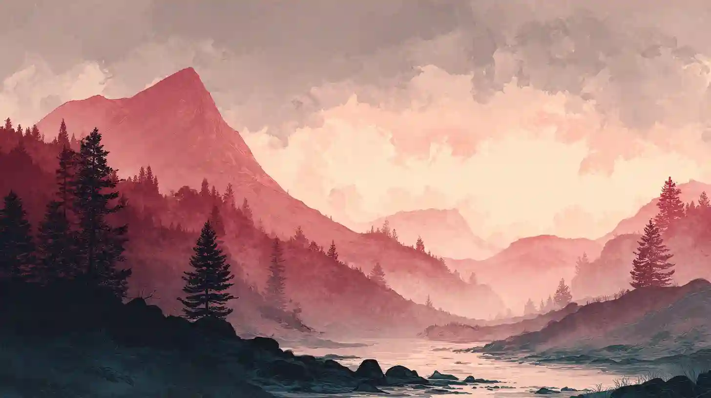
Color theory plays a pivotal role in shaping the emotional and visual impact of watercolor landscapes. In the realm of watercolor, where fluidity and blending are essential, understanding color theory allows artists to manipulate hues to evoke different moods and convey a sense of depth. The use of primary colors—red, blue, and yellow—forms the foundation of any painting. By combining these hues, artists can create a wide range of tones and shades, influencing the overall atmosphere of the landscape. For instance, cool colors like blues and purples can create a serene, calm feeling, often associated with distant mountains or tranquil waters. On the other hand, warm colors like yellows, oranges, and reds tend to evoke energy, warmth, and the vivid light of sunrise or sunset. This knowledge of color interaction extends to the application of complementary colors, those found opposite each other on the color wheel. When paired together, these colors can make each other appear more vibrant, a technique that adds contrast and drama to a scene. The balance between cool and warm colors can enhance the perception of space within the painting, making elements like the sky, foreground, and background stand out or recede. The concept of analogous colors—colors that sit next to each other on the wheel—also plays a crucial role in creating harmonious compositions. These colors blend smoothly, allowing for subtle transitions between elements of the landscape, such as the blending of a sunset sky into the horizon. Moreover, the use of color temperature, not just hue, can create visual interest and balance. For example, by painting a distant mountain range with cooler tones and a foreground with warmer ones, the artist can draw the viewer's eye to the more intimate, detailed areas of the landscape while giving the illusion of greater distance. By understanding and applying color theory effectively, watercolor artists can create compositions that not only capture the essence of a landscape but also communicate a specific mood or feeling through the subtle manipulation of color.